If you are familiar with CASPA’s Traffic Light Graph, you may have looked at the green, amber and red bands and wished you had known in advance how many pupils would appear in each band.
Good news – you can predict this before it becomes a fact (if pupils achieve their targets, that is).
All you need to do is make sure you get your pupils’ targets into CASPA, and use the Traffic Light Graph to look ahead to the end of the year.
Go to the Traffic Light graph (Reports | Comparison of progress vs expectations), choose a subject and analyse progress from last summer term’s result to the target for the end of this year (ie from Summer 2018 (result) to Summer 2019 (target) in CASPA 2019 as below). Click the ‘Plot by subject’ button (top left of screen) to view all subjects at once.
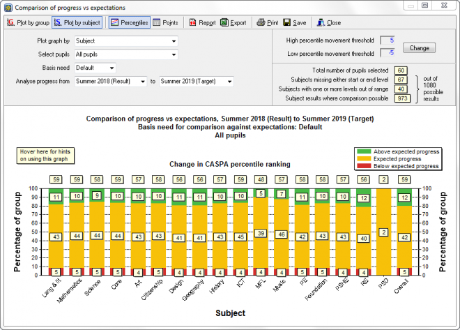
If this was your school’s graph and your pupils all meet their targets, this is exactly how your Traffic Light graph will look at the end of the year when the summer term results are in. Are you happy that this is right?
- If you have pupils in the red band, you have targets that are below CASPA’s expected progress
- If you have no pupils in the green band, you have no targets that will result in above expected progress
- If your targets reflect ‘expected progress’ across the board, the graph will be fully amber – no pupils are targeted to exceed expected progress
If your targets are, in effect, your plan for pupils, you can reasonably expect that most or all will meet their targets exactly. This graph is therefore a good predictor of how their actual attainment will pan out by the end of the year.
So… your mission is to decide whether you are happy with this. If around 15% of your pupils have targets that will exceed expected progress, you might use this as part of your answer to ‘How aspirational is your school?’ and similar questions. If you are not happy that this will be the outcome at the end of the year, the autumn term is a great time to change it. You can focus in on the pupils in the amber band who, with either more support or maybe just a review of the targets, might be able to be nudged into the green band. Look for the pupils whose ‘percentile change’, or Pctl in the hover list and report, are at +4; a little additional progress will pop them into the green band. Ask us about this if you would like to know more.
If you want to investigate any pupils, hover over the chart marks to identify them, and if you wish to find out more, double click on the chart mark and right click on a pupil to either drill down to their main data entry pages or for detail reporting options. Click on the ‘Report’ button to display the details on which the graph is based.