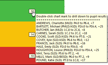
 The ‘Comparison of progress vs expectations’ graph is probably in the majority of users’ top two CASPA reports and graphs. So it is not surprising that we receive a lot of feedback on things that users would love to see added to it’s features.
These have been pretty complicated to develop, but we have enhanced this graph to include most of these in ways that we think will exceed your expectations!
So having hyped these enhancements, what have we actually delivered in the latest release? Most changes can be grouped into two broad areas, enabling users to:
- Drill down from the hover lists directly to the main data entry pages for a pupil
- Flexibly display the tabular report to focus on specific groups of pupils
 Drill down into pupil data
In all likelihood, you already know that hovering over one of the chart marks displays a list of the pupils in that band (see thumbnail at the top of this article).
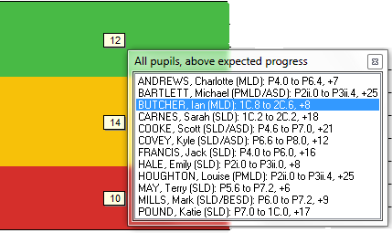
If your CASPA installation is up to date (Build 1.2.2.1. Check via Help | About if you are unsure), you will find that you can now double-click the chart mark, enabling you to select a pupil.
Often, you want to check the history of results recorded, needs selected, etc to answer a question about why this pupil appeared in the particular band in the Traffic Light graph. Sometimes you want to add or correct data. Right-click on a pupil in the list for options to view or edit the data for that pupil – one to take you to the data entry pages in read-only mode (view) and one to the historic data pages for the selected pupil in edit mode (edit). Double-click on a pupil to go straight to the data entry pages in read-only mode.
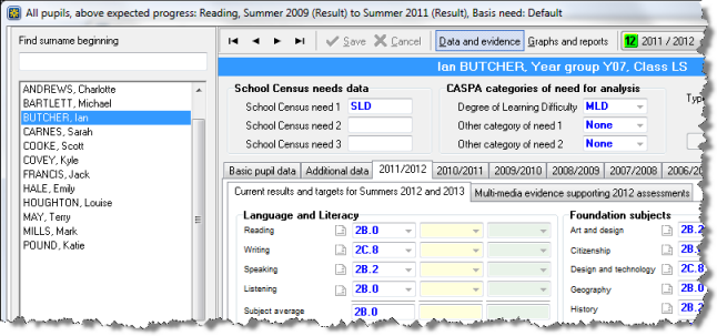
The list of pupils displayed on the left of the data entry page, when you view the details, is the same list of pupils from the band selected in the traffic light graph. So if you were investigating why pupils are in the red band, you can work through each pupil methodically.
When you close the data entry page, you are returned to the graph. If you return to the graph having edited any details, CASPA will refresh the graph to take account of changes. Never again will you need to close the Traffic Light graph to view or edit pupil details…
Extra chart marks
Additional hover marks have been introduced to replace the summary information that identified the numbers of pupils selected, those with data required for comparison and those with results out of range.
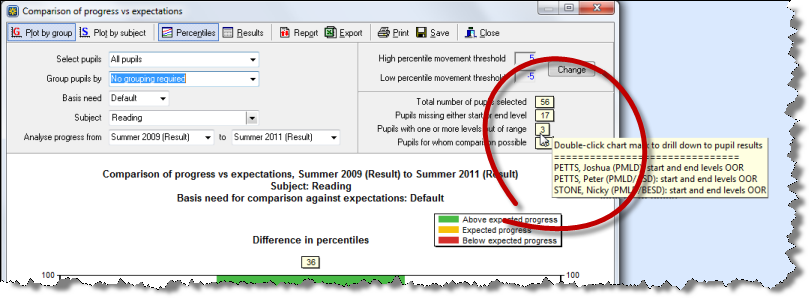
Now you can instantly identify pupils who are missing start or end year data (this used to show the number of ‘Pupils with data required for comparison’), those who have results that are out of range (as above), for the pupils selected and those for whom comparison is possible.
No more hunting through the report to find which pupils are missing data or are out of range. The drill down options mentioned earlier in this article are available for these hover lists too so you can go straight into the pupil’s data pages to check and, if necessary, make corrections.
Grouping pupils in the report by ‘comparison band’
You may be familiar with the report that sits behind the Traffic Light graph (via the ‘Report’ button above the graph). We are often asked if it might be possible to allow the data to be grouped according to whether the pupils are in the green band, amber band, etc. Now you can!
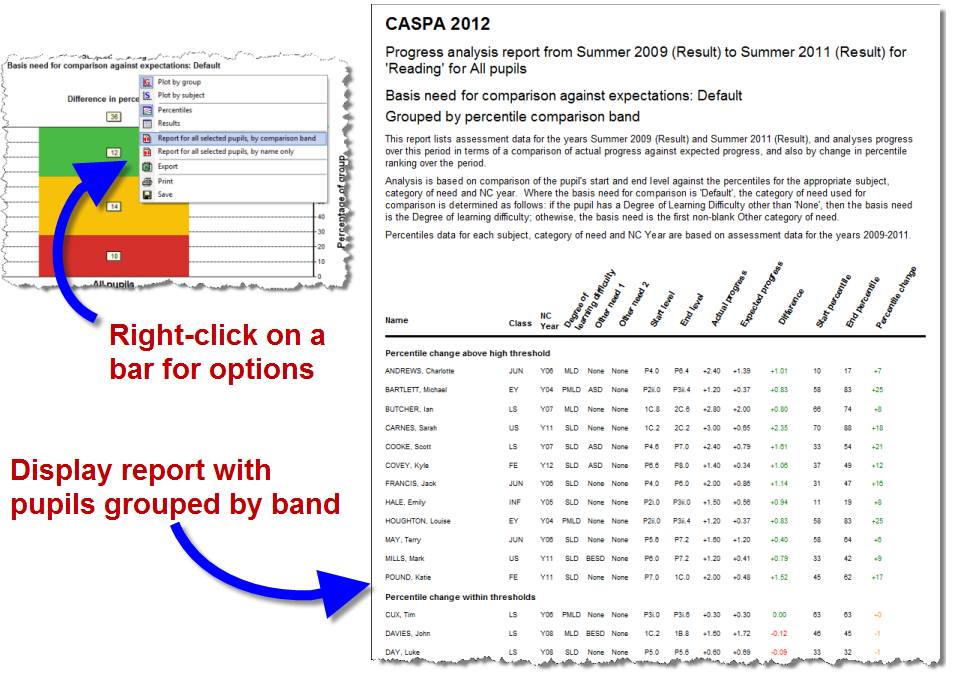
Other categories displayed are those pupils with results that are out of range, and those missing start or end dates. Strictly speaking, these are not bands, and they are not grouping options (as you may have grouped by gender in the graph already) so we’ve had to coin a new name for these. We call these ‘Comparison bands’.
Printing the report data for pupils in a single bar
Taking requests for this report further, we’re asked if it would be possible to print this report for just one bar when two or more bars have been displayed when a grouping option has been selected, eg group by gender to display one bar for boys and another for girls.
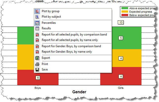
Once again, right click on the bar you are interested and you’ll find options to display and print the report for just that bar, or for all pupils.
Using your mouse’s right-click options
As you will have noticed by now, the mouse’s right button offers you additional features. This button is often overlooked, and you will find that your right mouse button gives you shortcuts to all sorts of menu options in CASPA. Our developers make use of the right-click options in their development tools to speed up their work and see no reason why you shouldn’t benefit from this principle throughout CASPA too!
Try a right-click on a Red/Amber/Green bar. You’ll find shortcuts to the toolbar menu options, and more besides.
Is there more?
There is! This article aims to highlight some of the key enhancements but there are additional related changes.
Drill-down:
You can also use the same drill-down option in two other places in CASPA immediately:
- In the ‘spread’ graph, displayed when you double-click on a bar in the Traffic Light graph
- In the CASPA percentiles graph (Reports | CASPA percentile graphs)
This drill-down feature will help you to improve your use of CASPA by making it easy to investigate results, targets and categories of need, saving you time in achieving this and enhancing confidence in your data and the resulting analysis of attainment and progress in CASPA.
Report:
The report noted above also applies different colour-coding; pupils who are ‘out of range’ are still highlighted in a red font, pupils missing a start and/or end level are now highlighted in a blue font.
The report button above the Traffic Light graph, when clicked, instead of opening the report will give you options to run the report, grouping pupils by comparison band or to run it traditionally, ordered alphabetically.
