Reviewing the spread of attainments for pupils with a given category of need
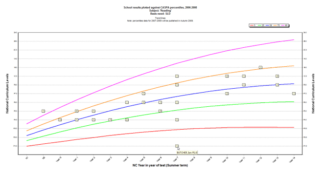
This version of the CASPA percentiles graph allows attainment results in a given subject for pupils with a given category of need to be plotted against the appropriate percentiles for that subject and category of need, these percentile lines being derived from analysis of anonymised data submitted to us by schools using CASPA. Each of the boxes represents one or more pupils working at a particular level in that year, the number in the box identifying the number of pupils found; information on the individual pupil or pupils represented by the box can be found by placing the mouse over the box, as shown below.
This graph not only allows us to see the spread of attainments for pupils of a given category of need within our school, but also allows us to review whether the categorisation of pupils is appropriate; category of need is one of the factors taken into account by CASPA’s bench-marking model, which is based on age, level of prior attainment and category of need, so appropriate categorisation is important for ensuring reliable bench-marking and analysis. In this case, the highlighted pupil (Ian Butcher, working at Level P1i.0 in Year 7) is working too far below the range of attainments usually found for pupils categorised as SLD for CASPA to be able to make meaningful comparisons for this pupil. In this case, the pupil may be felt to more naturally compare to other PMLD pupils, which would allow CASPA to make meaningful predictions of progress for this pupil.
For a fuller explanation of CASPA’s bench-marking model and the use of categories of need in it, please refer to the Adobe Acrobat PDF document that can be found by clicking here.
Click here or on the image below to open the report as a pdf document to view and print.

